What is the pen tool used for?
The pen tool is used to draw and connect lines you draw yourself to make a shape.
How van you manipulate a path/line in Illustrator? Discuss the use of the white arrow tool, pen +, pen - and convert.
You can use the white arrow tool to manipulate an anchor to change the line, distort it or make it smoother.
The pen + tool can be used to create an anchor point on a previously drawn line so you may use a tool to make another shape from that object.
Use the pen - tool to delete an anchor point to make the work distorted or if it is unneeded in the work
The convert tool can grab an anchor point and move it to a different location along with the lines the anchor had.
All of these can manipulate paths and lines.
How can you utilize the layers palette in Illustrator?
Click on the layers palette, you can hide or lock a layer by clicking in one of the boxes on the right hand side. Create a layer by going to the bottom left of the small window.
How do you create a clipping mask in Adobe Illustrator?
Place a rectangle/square on top of the work. Make sure it is ON TOP (in the front). Make sure it has no fill and highlight the ENTIRE work you want to be a clipping mask. Go to Object -> Clipping Mask -> Make, then you have your clipping mask.
Friday, September 23, 2011
Thursday, September 15, 2011
Review Week Five
Shape
 It has shape because it defines a certain part of the image. There are many shapes within this star, defining the star and its center. It has organic shapes and without the use of color defines the image.
Line
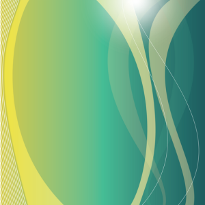 This shows lines. See how the lines move and curve, showing movement. The designer used the lines for that purpose, movement and to draw the eyes of the view to a certain part of the image. Because of the thick and slow curve lines, the artist is able to set a smooth and relaxed movement.
Texture

This has texture. Artist used the texture of water, flowing, wavy, and somewhat calm. You can see the small bubbles and bumps, you can almost feel it. The light in the picture helps define the texture. So, you can see the waves and the distortion of light helps us see how hard or soft the texture is.
Space
 This shows space. The space in this picture can have the sense of losing yourself the longer you look at it. You can see the lines are far apart from each other so your eyes can land anywhere and can be free to wander around area after area.
Value
 This poster shows value. Value is basically a scale from black to white, dark to light. This bird has very dark values, setting a dark mood on the bird, not the leaf. The leaf is not as dark, so it draws attention to the viewer from the leaf to the bird down through the feathers. The background is plain so we can focus on the object. You can also see where the "light" hits the bird from the bottom and it gets darker the higher it gets, away from the light.
Line
Texture
This has texture. Artist used the texture of water, flowing, wavy, and somewhat calm. You can see the small bubbles and bumps, you can almost feel it. The light in the picture helps define the texture. So, you can see the waves and the distortion of light helps us see how hard or soft the texture is.
Space
Value
Friday, September 9, 2011
Review Week Four
Why/how can icons be used to communicate?
To communicate to an audience with simple images that are easy to understand.
Via the internet, find 2 examples of common icons that clearly communicate their message. Post both in this entry.


What is the difference between copyright and public domain?
Copyright is when someone has legal right to a certain work, public domain means that the work is open to the public.
How can you avoid plagairism in this class? In other classes?
Make your own or make a works cited page and a bibliography.
Tuesday, September 6, 2011
#1 Podcast Elements of Design
What does it take to create good graphic design?
Pleasing to the eye and convey’s information
What is the difference between elements and principles?
Elements are the parts we add to the desgin. Principles tell us how we should organize the elements on the screen.
Name the six (6) elements of design.
Line, shape or form, space texture, value and color.
What can lines aid in, when alone or combined with other lines or shapes?
The readability, appearance and message of a design.
Which lines suggest a feeling of rest? Why do you think?
Horizontal because they are just straight and flat so you don’t need to look so hard.
Vertical lines communicate a feeling of what? Why do you think?
Loftiness, extened lines suggest an overpwoering grandeur.
What lines suggest a feeling of movement? Why do you think?
Diagonal because it is unstable in relation to gravity.
Soft, shallow curved lines suggest what? Why do you think?
Comfort and relaxation because its soft and easy.
These lines suggest confusion and turbulence? Why do you think?
Deep acute curves because its sudden and confusing.
What element defines a specific area of space?
Shape
What is the difference between two dimensional shapes and three dimensional shapes?
2D has width and height, while 3D has all of those plus depth.
Describe the difference between geometric shapes and organic shapes?
Geometric usually is symmetrical, Organic are irregular and fluid.
What are abstract shapes?
Stylized versions of organic/natural shapes.
Which basic shape projects an attitude of honesty or equality?
A square
What do triangles suggest?
Action or stability
Circles convey feelings of what?
Protection or infinity
Describe positive space and negative space?
Positive refers to the object and elements, negative refers to the shapes aroung and between the elements.
What is texture?
The actual surface of the desgin with the reader to actually being able to touch the materials on the page.
Incorporating texture into a design can help do what?
Illusion of texture in 2D
What is value?
The degree of light and dark in design.
What is another name for value?
Tone
What can the element of color do when incorporated into a design?
It can be applied to another element
Friday, September 2, 2011
Review Week Three
1. What is OSHA? What do the letters stand for?
Occupational Safety and Heath Association, regulates safe work places.
Occupational Safety and Heath Association, regulates safe work places.
2. How can graphic designers effectively communicate? In your own words, explain the communication process.
Through the use of pictures and creative images, graphics.
3. Understanding the history, culture, and movements of fine and graphic arts will make you a better producer of visual messages. Why?
It is better that the reader can understand the art, so using all of the above helps communicate the message.
Subscribe to:
Posts (Atom)